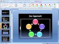
Question: What is Microsoft PowerPoint?
How Do I Use PowerPoint?
 Answer: PowerPoint is a presentation software program that is part of the Microsoft Office package.It is the best first addicting a computer user.
PowerPoint is one of the simplest computer programs to learn. It is the
program used worldwide for presentations. Anyone can create stunning
presentations that look like they were designed by a professional.
The slide show can be enhanced using and animation. music, sound, video slide can be added to these slide shows and they can run unattended by using.The slide show is most often projected on a screen using a digital project.
working procedure: 1st time setup the Microsoft office Xp.
my desktop start button click > Microsoft office > power point click >open.
file menu new project blank document.
Background animation : any background select > slide show menu > slide Transition and any animation select.
Tittle animation: right the tittle and tittle slide > slide show menu > custom animation select you any slide.
use image clip art: There are two schools of thought about images in presentations. Some
say they add visual interest and keep audiences engaged; others say
images are an unnecessary distraction.
Both arguments have some
merit, so in this case the best option is to split the difference: use
images only when they add important information or make an abstract
point more concrete.
While we’re on the subject, absolutely do not use
PowerPoint’s built-in clip art. Anything from Office 2003 and earlier
has been seen by everyone in your audience a thousand times – they’ve
become tired, used-up cliches, and I hopefully don’t need to tell you to
avoid tired, used-up cliches in your presentations. Office 2007 and
non-Office programs have some clip art that isn’t so familiar (though it
will be, and soon) but by now, the entire concept of clip art has about
run its course – it just doesn’t feel fresh and new anymore.
1. Write a script. A little planning goes a long way. Most presentations are written in PowerPoint (or some other presentation package) without any sort of rhyme or reason.
That’s bass-backwards. Since the point of your slides is to illustrate and
expand what you are going to say to your audience. You should know what
you intend to say and then figure out how to visualize it. Unless you
are an expert at improvising, make sure you write out or at least
outline your presentation before trying to put together slides.
And
make sure your script follows good storytelling conventions: give it a
beginning, middle, and end; have a clear arc that builds towards some
sort of climax; make your audience appreciate each slide but be anxious
to find out what’s next; and when possible, always leave ‘em wanting
more.
Limited Color Vision
Avoid the situation where important information is conveyed only in the form of color. - Being friendly to colorblind people does not necessarily mean that one should not use colors. Even for colorblind individuals, colors are very
useful cues to distinguish different objects easily and quickly. By carefully selecting colors that are easily recognizable to people with all kinds of color vision, one can maximize the effect of her/his presentations. Avoid the situation where texts and objects are obscured with the background. - For example, there should be enough contrasts in brightness and saturation between texts/ objects and backgrounds. Avoid the combination of colors
that have the same brightness but different only in hue. For example, red characters on green backgrounds unreadable for colorblind individuals. Use either bright texts/objects over dark backgrounds, or vice verse. Make texts and objects as thick or big as possible. - When the size of color-coded objects is small, only a few cone cells can be used for recognition. Colorblind people find it especially difficult to distinguish the colors of thin lines and small symbols. For color-coded text, use bold fonts such as Arial or Helvetian rather than thin Times or New York .
Have Slides at the End of Your Presentation
The last slide you speak to should not be the last slide in your presentation file. You should have three identical copies of your last speaking slide so that if you accidentally advance one too many times at the end of your presentation, your audience never knows because you don’t drop into the program, the slide looks like it has not changed. After these slides, you should include some slides that answer questions that you expect to be asked. These slides will be useful during Q&A sessions after the presentation. The final slide should be a blank slide so that if you go through all the other slides, you have a final backup from dropping into the program.


